
Online Store Redesign
MUJI
Select my product from the MUJI online store
SUMMARY
Problem
MUJI users are having difficulty deciding between too many similar options, especially when using the online store, which has an unclear navigation system.
Approach
This project suggests a new feature that allows users to directly compare detailed information between similar products.
ROLE
-
Conducted research on existing website and users, and with team members
-
Synthesized research findings, defined the problem, and created a persona, and user journey map
-
Built strategies, created wireframes and prototypes, and conducted user testings and design iteration
-
Created a hi-fidelity UI prototype.
TEAM
Ricardo Ortiz
Jennifer Regan
METHOD
Contextual Inquiry
Competitive Analysis
Screen Survey
Usability Testing
Sitemap
Card Sorting
Heuristic Analysis
Persona
User journey map
User flows
Wireframes
Prototyping
Introduce the Project
MUJI is a Japanese retail company that offers a wide variety of household and consumer goods, including stationery, household items, and apparel.
MUJI Online Store
Project Goal
Improve customer satisfaction with MUJI online store experience.

Find Opportunities to Improve
To find opportunities for improvement of the product, my team conducted research using multiple methods and with multiple goals.
Screener Survey
-
We identified qualified participants for contextual inquiry and usability testing.
-
The survey explored how users use MUJI online and the offline store.
Usability Testing on existing website
-
We observed the online store user experience to find the pain points.
-
We planned the task scenarios based on our findings from the online store contextual inquiry.
Competitive Analysis
-
This analysis helped us to understand where MUJI is located in the marketplace.
Contextual Inquiry (In-store & Online)
-
We used this method observe how the online and offline stores are used.
-
The inquiry identified common and different features of using the two different stores.
Card Sorting
-
We used this method to understand the existing navigation system and information architecture.
-
This technique produced feedback on how we can improve the information architecture
Heuristic Analysis
-
We evaluated the usability of the website in detail based on findings from other research
Synthesis & Findings
After conducting the research, the team shared their findings. Then, we each individually synthesized the research and defined the core problem to create a solution.
Sensory Interaction

Users like to browse different products at in the physical and the online Store.

They like to interact with products by looking, touching, using, sitting on, smelling and feeling.

They are afraid to buy new products online because they cannot interact with the products.
Confusing Navigation System

Current navigation system confuses users when they try to find necessary information on the products

Even if the users find some information, they still cannot understand what it is
For example

Usability Testing on Existing Website
Task
We asked users to choose a grid notebook and add it to the cart
Result
4 out of 4 users failed to understand the long product title when they found the list on the left, and asked,
"What is the difference between the two? They look the same here"
This image is from muji.us/store
Based on the insights, I created a persona, Megan, and her journey map that represent the users and solidify their behavior, needs and pain points.
PERSONA

Megan's Journey Map

Main Pain Points
-
When she searches
for the product she bought before, it is hard to find a specific product using the confusing navigation system.
-
When browsing
the website to find something new, Megan can not be sure what the product really is

"Because they have many different sizes, I pick up 3 of them just to see which one is the best."
PROBLEM
Too Many Similar Products

MUJI has a lot of similar options and users like variety.
However, at the same time, the products are too similar to find the difference so users have difficulty finding the right product for them
How might we simplify the decision-making process?
STRATEGY
Before moving to the design process, I drew from the research to establish a few core strategies for creating solid solutions:

Use Images More
because users prefer sensory interaction to reading text

Make Comparison Easier
by optimizing the navigation system so users can easily compare similar products
SOLUTION
Sitemap
I redesigned sitemap to optimize the navigation system.

Key issues
found from card sorting and usability testing
The hierarchy between categories is unreasonable

"Why are there separate categories to 'Apparel' and 'Children' ?"
The language is unclear

"What is 'PP Holders'? Pee comes to mind."
Approach
-
Reorganized the hierarchy of primary and secondary categories.
-
Changed category languages.

Features, Wireframes & Design Iteration
Defining Features

Ideation & Initial Sketch
To implement the design strategies
-
I conducted 2 ideation sessions. I scheduled time and sketched ideas
-
I picked a few features based on importance and feasibility, then refined the sketches of key screens using the existing user flow.
Refining Features
V1
Wireframe, Prototype & Iteration
-
Using the sketches, I created low-fi wireframes and prototypes.
-
I conducted 3 rounds of usability testing with 4 users in each rounds.
-
After each round, I improved the interface to higher fidelity wireframes based on feedback.

V2

V3

Change Global Navigation
-
from side navigation to top navigation
Fill out the content with promotion images
-
to avoid information overload by using less text
Home Page

Existing Homepage
V1

Iteration
"These categories can be merged."
Issue
Because of the limited time, I could only redesign a part of the sitemap that related to the usability test scenario.
Approach
During the usability testing, I gathered more feedback on the global navigation categories. I improved the sitemap after synthesizing the feedback.
V3


Comparison Feature Introduction
I introduced a new comparison feature to optimize the comparison experience for similar products.


Select Products
-
Users can choose products they want to compare on the product list page.
-
The selected products are shown on the compare bar located on the right side of the page
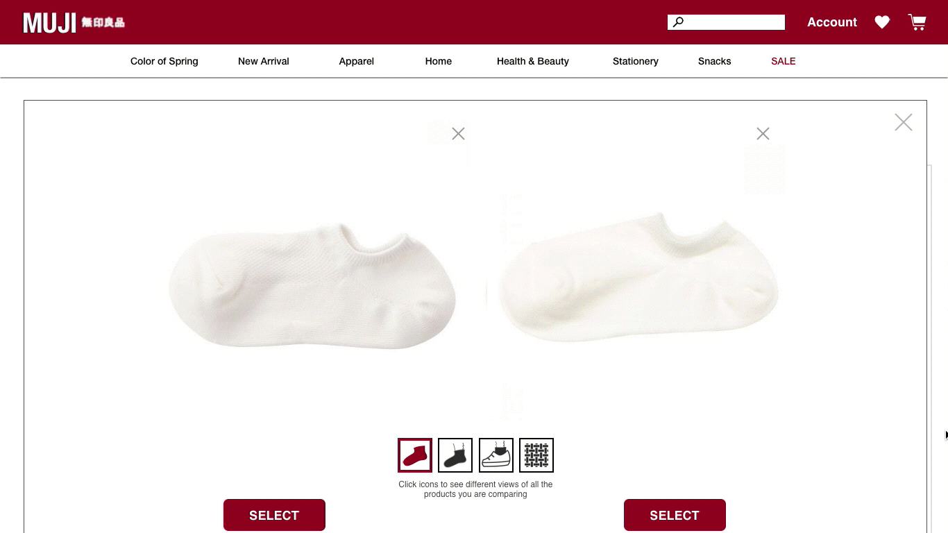
Compare Details Side-by-Side
-
Product images in context
-
Product details by category
Challenges
Because this is an unfamiliar feature for users, it was challenging to help first-time users understand the interface. During iterations, I revised the interface based on the feedback collected from usability testing
Comparison Board
-
Users can select the products they want to compare by adding them to the comparison board
Shorten the Product Title
-
I eliminated gender, size, and the number of options
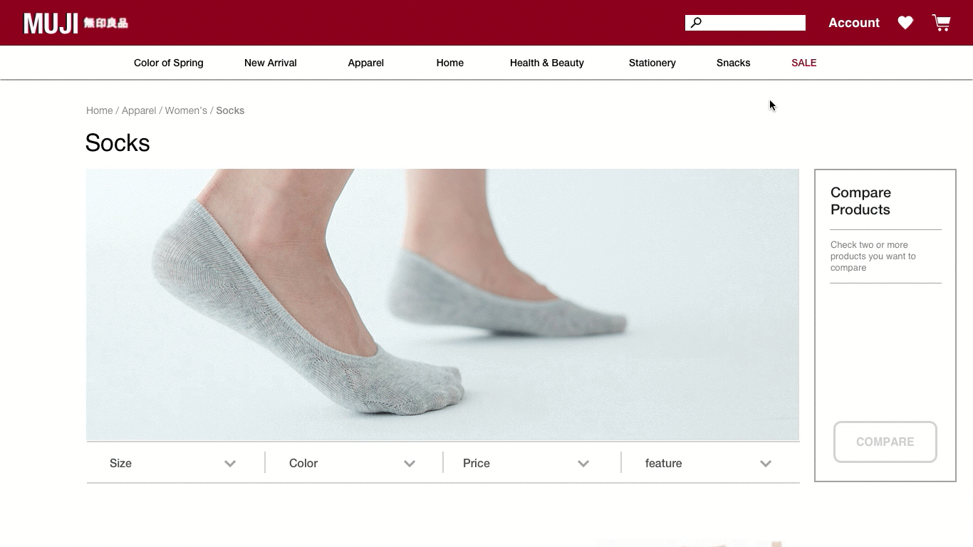
List Page

Existing List Page
V3

Iteration
"What is this check box for?"
Issue
Users hesitated to click the check box on product thumbnails because they were not sure what it is for.
Approach
I added "Add to Compare" text next to the check boxes.
"I thought this was a header."
Issue
The "Compare Product" button on the "Compare Board" looked like the header.
Approach
I put the "Compare Product" button at the bottom of the board

V1

Comparison Pop-up Window
Users open a pop-up window by clicking the "Compare Product" button on the list page to compare detailed information about the chosen products
V3


V1
Iteration
"I thought these were recommended products."
Issue
6 out of 8 users did not click the context option buttons because
-
they did not find the buttons, or
-
they thought it was a recommendation, for example, "You may also like."
Approach
-
Users expect to see option buttons (context option buttons) after they find the main content (product photos).
-
Therefore, I put the context photo icons below the product photos

Next Step
-
Add a product directly to the cart: 2 out of 4 users wanted to add selected product to the cart directly from the comparison window. I will revise the interface and conduct another round of usability testing to check if users want to each product page even though they do not have to during the shopping process.
-
Compare more than 2 products: 2 out of 4 users wanted to see the comparison window layout when users compare 3 or more products. The whole layout has to be changed to display more than 2 products, so I will have a few ideation sessions to sketch the possible layout and create multiple wireframes and prototypes, and conduct tests to ask users which one they prefer.
REFLECTION
-
Consider eye movement for information display and layouts.
-
During iterations, I struggled to lead users to click on the photo icons, and discovered the icons should be below the product photos because this flow is more natural for users.
-
-
Information Architecture
-
Even though I had research findings from card sorting, usability testing, and heuristic analysis, revising the sitemap was very confusing. I need to conduct more usability testing to optimize it.
-