
SUMMARY
Problem
Low user activity from uncompetitive content with too many features and target users hindering users' understanding of the website.
Approach
-
Changed the content strategy and onboarding process
-
Conducted design iteration on wireframes with usability testing
-
Created hi-fidelity UI mockup of main pages
CLIENT
MySportsShare
ROLE
-
Led the team throughout the whole process (client communication, research, problem definition, and design iteration) by planning daily tasks, leading a discussion of each task, conducting the tasks, and synthesizing the task results
-
Created hi-fidelity mockup
TEAM
Shuhan Yu
Azhar Bahrainwala
TIME
May 2018
METHOD
User Interview
Usability Testing
Competitive Analysis
Persona
User journey map
Affinity Mapping
User Flow
Wireframes
Prototyping
Introduce the Project
MySportsShare.com
MySportsShare.com is a platform on which sports people (athletes, coaches, teams, leagues, fans, etc.) can communicate and organize their sport-related activities.
For example, teams and leagues can plan and manage games. Players can upload their performance videos and photos to promote themselves.

Project Goal

Retain more returning users
The client found that there is low user traffic (activity) on the current website.
Project Scope

Help athletes with self-promotion
The website has many different features for multiple target users, but the primary goal of this project is helping athletes who have little support to promote themselves.
Issue 1: Onboarding Process
Why don't users use the website?
To understand the reason for this, we conducted a usability test on the existing website with 4 users and observed how they understand and use the product.
Problem
Too many Target Users & Features
Because MySportsShare has too many target users with too many features, users cannot understand what they can do on the website.

Website descriptions by target users
on MySportsShare landing page
"So who is this site for?"
There are multiple primary target users who are athletes, coaches, and leagues.
Even after users read the description on the landing page, 4 out of 4 of them were confused about who the website is for and what its purpose is.
"What should I do now?"
Too many features for each target user are mixed together with no grouping, hierarchy, or priority.
The users clicked through the website, but their lack of understanding prevented all of them from doing any activity.

Profile Page
Approach
Focus on providing fewer features
For a better onboarding process, my team decided to

Prioritize one target user
Define only one primary target user

Emphasize a few main features
Determine the most important features for self-promotion
Issue 2: Self-promotion
Understanding Athletes’ Self Promotion
User Interview


To understand
-
Which athletes need self-promotion
-
How to do it & what the athletes need
We interviewed 5 athletes, 1 coach, and 1 parent and noted the answers below.
Who needs self-promotion?

Mid-level players
Athletes who are not the top players getting attention without conducting extra promotion

No strong network
A strong network with local recruiters increases the possibility of making recommendations to coaches
What do athletes need to show to be evaluated?
Coaches and recruiters are looking for

Performance Videos

Stats
to decide if they want to meet the athletes in person.
Problem
Just Another Similar Platform
Usability Testing
During usability testing on the existing website, we asked users to use MySportsShare’s self-promotion feature which is uploading performance videos.
"Why wouldn’t I just do this on YouTube?"
During the task, all the users told us they would just use YouTube, Instagram, or Facebook instead of MySportsShare.

Add Videos page

This is because those platforms have a much bigger user pool that gives the athletes more opportunities for exposure. Users do not need other similar platforms like MySportsShare to get their performance videos to go viral.
Approach
Finding Unsolved Problem Space
Therefore, we needed to find

User Needs
not met by other platforms

Features
not limited by the size of the audience pool
Going Back to Research Findings
We went back to the research findings and created a persona and user journey map to organize the data and find an unsolved problem space.
PERSONA

PAUL'S JOURNEY MAP

Problem Space
When Looking for sports events to participate in,
Paul misses some events because he has to keep checking many different social media accounts.
Share Defined Problem
We defined the problem space as the problem to be solved and wrote a problem statement to share with the clients and other stakeholders.

Problem Statement
Mid-level athletes without strong networks need to use a large number of platforms for promoting themselves and connecting with potential events.
How might we help Paul to easily connect with open recruitment opportunities?
Features, Wireframes &
Design Iterations
Decide Main Features with the Client
Before moving on to the design phase, we reported to the client our research findings and suggested pivoting the problem space.
Based on our findings, my team and the client arrived at 3 main features to focus on in this project.
For Onboarding

Optimizing Onboarding Process
Get returning users
For Self-Promotion

Finding Events
Help athletes to easily find tryout events

Athlete Profile
Support athletes in sharing their performance data with coaches and recruiters
1st Ideation & Sketch Session
While sketching user flows and wireframes, my team decided on the main components of each feature based on research findings and feasibility.


1st Usability Testing
We converted the sketch to a digital prototype and conducted usability testing with 4 users.
2nd Ideation & Sketch Session with Client
We shared the first test's results with the client and conducted the 2nd round of ideation and sketching with the client to update the wireframes based on feedback from the testing.


Version 2

Version 3
Refining Features
We conducted another round of usability testing on the updated wireframes with 4 users, obtained feedback, and improved the wireframes for the 3rd version.
High-fidelity Mockup
Based on the 3rd version of the wireframes, I created high-fidelity mockups of a few main pages to suggest a design system.


Finding Events
We collected sport event posts from different social media and listed them in one space so athletes could easily find and organize interesting events.
Version 1

Version 2

Design
We learned about the range of feasible technology from the dev team after the 1st usability test, which allowed us to decide on the page layout and interaction.
Iteration
"What am I tracking?"
For the 1st wireframe, 4 out of 4 users did not understand the meaning of the word 'track'. Thus, we changed the word to a more familiar word, 'follow'.
Version 3


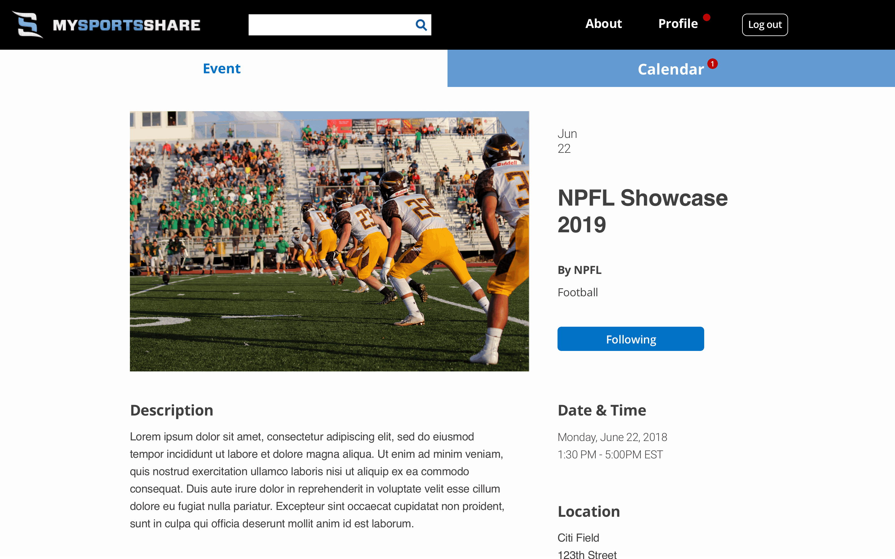
Event List
Event Description
Iteration
"I want to see description before deciding to follow it or not"
Even though there was a description on each post for the 2nd wireframe, 3 of 4 users thought there should be a separate description page for each event.
Therefore, we got rid of the descriptions on the list page and organized the information on separate description pages.
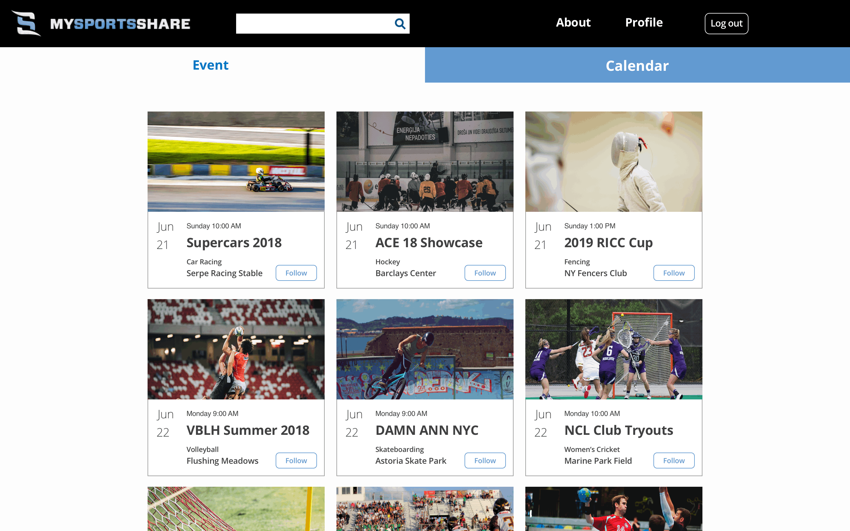
Calendar
In the 2nd ideation session, the client and the team agreed to create a calendar where the following events were saved and organized.
Version 1

Version 2

Design
Users can see the following events by date and get detailed information by clicking each post.
Iteration
"I would just click the calendar to see the details"
To check the details during testing, 3 of 4 users clicked the post on the calendar instead of using the list on the left.
Thus, the interface was changed to show an overlay when each post is clicked. Users can move to the description page by clicking the overlay.
Onboarding
We focused on introducing an ideal onboarding flow so that users could easily understand how to utilize each feature of the website.
Original

Landing Page
Version 2


Onboarding Description Overlay
Landing Page
Design
-
Description focused on athletes to clarify the target user
-
Easy and short copies to encourage first-time users to read and understand
-
Overlay suggesting an onboarding flow after signing up
Iteration
"I don’t sign up before I explore the site"
In the 2nd testing round, 3 of 4 users said they would drop off if they had to sign up on a new website before exploring it.
Therefore, we suggested progressive onboarding to the client on the 3rd wireframes.
Version 3: Progressive Onboarding
Landing Page = Event List
Users can explore all the different pages from here.
Prompt to sign up
after certain actions like following an event.

Notification Icons
pop up on menu bars to guides users to move to other pages.
Athlete Profile
This is a public portfolio where athletes record their performances and where coaches can find core information for recruiting. Our goal was providing a seamless and compelling recording process.
Version 1

Building profile during sign up

Finished Profile
Design
For version 1, filling the profile is a part of the sign-up process. After completing all the steps, users can see the preview mode that other users like coaches and recruiters will see.
Iteration
"I need more clear descriptions"
During the testing, all users asked for more clear descriptions of each step.
"I want to know what it looks like to other people. Like a preview page"
Users also pointed out the visual gap between the building pages and view page.
Version 2

Design
Users can fill their profiles directly on the layout, which will be published for public consumption in this version along with a guidance bubble and CTAs on the right of each section.
Iteration
"I need more description!"
3 out of 4 users did not find the guidance bubbles, so they could not use the interface at all. They were just scrolling up and down to find more descriptions.
Version 3

Design
For the 3rd version, my team put the guidance on the top and the CTAs on the bottom of each section so that users would not miss them when they were looking through the page.
Next Steps
-
Filters on the event list by sport and location
-
Stat infographics to encourage athletes to record their performance
-
Stat entry reminder after an event that is saved on the calendar
REFLECTION
Changing the Project Direction
Until the kick-off meeting with the client, my team's goal was improving the existing interface. While doing research, however, we figured out that the existing interfaces did not fulfill the user needs. So the team had to confront the fact that we had to find a new problem space and start from scratch in the given time. This was a big challenge for us, but as a result, it was a good opportunity to learn to prioritize tasks and manage limited time and resources.
Persuading the Client
Another big challenge with pivoting the problem space was convincing the client. My team spent time and effort to make a strong argument with sufficient reasons and logic for the research report. I found that showing user quotes from research and testings and that including the client and stakeholders in the ideation session is an efficient way to persuade them.